
Fusion
Test description
Fusion
Problem + Context
Nomad Health is a recruiter-less platform that connects 300k+ Travel Nurses and Travel Allied Health Professionals to jobs across the country. As Job Discovery UX Lead, I conducted a heuristic evaluation of the search experience and identified a few key areas of opportunity that would enable my team to drastically improve user experience and, inturn, drive higher engagement.
Project Goals + KPIs
The primary goal was boosted engagement: efficiently funneling high-intent users to a job’s details page, where they could learn more about the job and apply. (In our case, a high intent user was someone who wanted to start an application.) I hypothesized that by “cleaning up” the search results (job cards) and only showing users the information that was most pertinent to their search, we could decrease the mental load taken on by our users in order to decipher whether a job could be right for them.
Metrics: Targeting a rise from 24% to 30% in Job View to Application Start.
Role + Collaboration
Steering Job Discovery at Nomad Health, job search and all related initiatives were entirely under my ownership. My synergy with Product Managers, Engineers, QA Analysts, and specialists fostered a seamless Agile environment. Additionally, the success of this initiative was only made possible with collaboration with our research coordinator, job posting team, machine learning team, marketing, and clinician excellence (former HPs employed by Nomad).
Tools
Research was conducted in Maze and UserInterviews, Data was sourced from Amplitude and Fullstory, Designed with Figma.
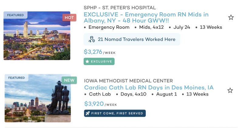
Job Results: Starting Point
Job titles are long and distracting, information is repetitive, and tags like “Hot” and “1st Come, 1st Serve” are not meaningful.
Research
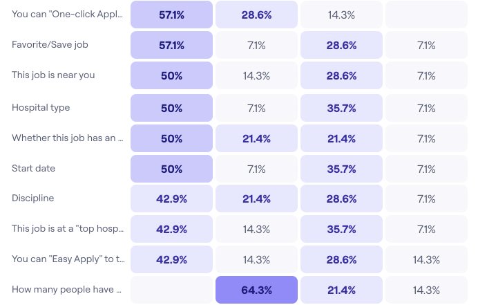
Card Sorting: Direct feedback from 12 participants illuminated job information organization preferences:


Focus Groups: Feedback from 16 users dissected designs of varying levels of fidelity.

Low-fi mockups
Hi-fi mockups
Research summary: a simplified, clarified job card means informed, confident users.
The process of job searching can be a daunting and tedious one even for the most seasoned travelers. That said, anytime we can make a job listing card easier to digest by
Simplifying (e.g., removing excess information, arranging content according to usability standards, using tools like color to differentiate information, etc.), and
Clarifying (e.g., explaining industry standard and Nomad-specific terminology)
... we are not only enabling our users to make a faster decision regarding a job, but also empowering them to feel informed and capable to make the right decision.
Design Decisions

Unified Layout: A coherent design across web and native mobile for streamlined operations.
Job Titles: Precisely tailored for minimal visual distraction.
Photo Removal: Addressed compliance issues and error prevention.
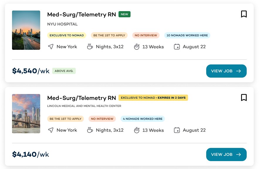
Improved Tagging: Re-evaluated and refined job tags based on user feedback and research insights.

A closer look at job tag logic
Outcomes
Primary Metric: The Job View to App Start metric witnessed a 5% improvement.
Tag-Specific Engagement: Jobs with the "Exclusive" tag saw a 17% improvement in click-through rates, while those with the "Auto-Offer" tag experienced a 14% boost.
Completion Metrics:
Job View to Job Application Completed: 12% improvement
With the "Exclusive" tag: 16% improvement.
With the "Auto-Offer" test: 19% improvement.
Continuous Improvement
After the MVP redesign was released to users, we introduced the “One-Click Apply” tag (for qualified users), this resulted in,
12% more clicks with a surge of 6.2% in HPs with applications submitted and a 20% decrease in application start to completion time
Another meaningful change we made as an organization was undergoing a massive rebrand:

Responsive Web Experience

Native Mobile Experience